Tutorials Style Guide - Example Page Layout
From Help Wiki
Page Summary: Succinct description of what this page is about. Could be two lines worth but shorter is better. Adding an application's icon as a small image can also help orient readers.
Title of tutorial "chunk" (level 2)
Brief overview to orient what is being done in this section. May not always be necessary.
Subheading (level 3)
Brief overview to orient what is being done in this section. May not always be necessary.
- Numbered step
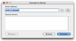
- Numbered step with link to larger version of figure graphic. Figure 1
- Numbered step
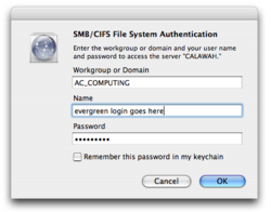
- Numbered step with link to larger version of figure graphic. Figure 2
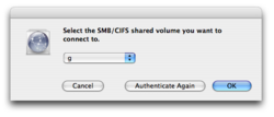
- Numbered step with link to larger version of figure graphic. Figure 3
- Embedded images work well when small

Subheading (level 3)
Brief overview to orient what is being done in this section. May not always be necessary.
- Numbered step. Use bold text when indicating menus for clicking, i.e. Go > Connect to Server
- Urls should be written out fully https://studentfiles.evergreen.edu
Additional heading with collapsed content
- Use the a collapsed section for "nice to know" information
- Do not put critical info in here as it may not be seen by users


