Tutorials Style Guide - Example Page Layout
From Help Wiki
Page Summary: Succinct description of what this page is about. Could be two lines worth but shorter is better. Adding an application's icon as a small image can also help orient readers.
Title of tutorial "chunk" (level 3)
Brief overview to orient what is being done in this section. May not always be necessary.
Subheading (level 4)
Brief overview to orient what is being done in this section. May not always be necessary.
- Numbered step
- Start steps with the verb or action to take
- Use bold menu steps such as File > Export > Export as PDF
- Keep it brief, this is not a place to get chatty
- Use hyperlinks embedded in the steps to take folks to relevant articles but don't over do it
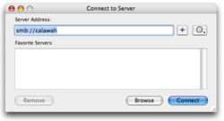
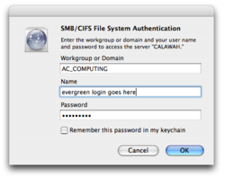
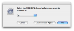
- Embedded images work well when small

- Urls should be written out fully https://studentfiles.evergreen.edu
Additional subheading with collapsed content
For pages with perhaps TOO much content, collapsing non-critical sections can help users not feel so visually overwhelmed
- Use the a collapsed section for "nice to know" information
- Do not put critical info in here as it may not be seen by users


