Difference between revisions of "Inadequate Color Contrast"
| (7 intermediate revisions by 2 users not shown) | |||
| Line 14: | Line 14: | ||
<span style="color:yellow;">Example of inadequate color contrast </span> | <span style="color:yellow;">Example of inadequate color contrast </span> | ||
| − | (Yellow is | + | (Yellow is an example of a color that usually doesn't contrast well against a white background.) |
| − | + | ||
'''versus''' | '''versus''' | ||
| Line 22: | Line 21: | ||
| − | + | ====Using color can enhance the meaning of an important passage, however, it is important to be careful to choose colors for the text that contrasts well with the background color of the page. ==== | |
| − | ====Using color can enhance the meaning of an important passage, however, it is important to be careful to choose colors for the text that contrasts well with the background color of page.==== | + | '''A light color such as pink can be a problematic text color:''' |
| − | + | ||
| − | + | ||
| − | + | ||
| − | '''A light color such as pink can be a problematic text color''' | + | |
<span style="color:pink;"> Lorem ipsum dolor sit amet, consectetur adipiscing elit, sed do eiusmod tempor incididunt ut labore et dolore magna aliqua. Ut enim ad minim veniam, quis nostrud exercitation ullamco laboris nisi ut aliquip ex ea commodo consequat. Duis aute irure dolor in reprehenderit in voluptate velit esse cillum dolore eu fugiat nulla pariatur. Excepteur sint occaecat cupidatat non proident, sunt in culpa qui officia deserunt mollit anim id est laborum. </span> | <span style="color:pink;"> Lorem ipsum dolor sit amet, consectetur adipiscing elit, sed do eiusmod tempor incididunt ut labore et dolore magna aliqua. Ut enim ad minim veniam, quis nostrud exercitation ullamco laboris nisi ut aliquip ex ea commodo consequat. Duis aute irure dolor in reprehenderit in voluptate velit esse cillum dolore eu fugiat nulla pariatur. Excepteur sint occaecat cupidatat non proident, sunt in culpa qui officia deserunt mollit anim id est laborum. </span> | ||
| Line 35: | Line 30: | ||
| − | '''However a dark color such as | + | '''However, a dark color such as purple usually contrasts well against a white background:''' |
| − | <span style="color: | + | <span style="color:purple;">Lorem ipsum dolor sit amet, consectetur adipiscing elit, sed do eiusmod tempor incididunt ut labore et dolore magna aliqua. Ut enim ad minim veniam, quis nostrud exercitation ullamco laboris nisi ut aliquip ex ea commodo consequat. Duis aute irure dolor in reprehenderit in voluptate velit esse cillum dolore eu fugiat nulla pariatur. Excepteur sint occaecat cupidatat non proident, sunt in culpa qui officia deserunt mollit anim id est laborum.</span> |
| − | ===Typically | + | ===Typically Canvas and WordPress will automatically format your page with adequate color contrast=== |
| − | However, if you wish to change the color of your text on your site here are | + | However, if you wish to change the color of your text on your site here are directions: |
====To change the color of your text within Canvas:==== | ====To change the color of your text within Canvas:==== | ||
| − | |||
| − | |||
#Highlight the text you want to change to another color. | #Highlight the text you want to change to another color. | ||
#Click on the '''Text color''' icon (letter "A" at left in the toolbar). | #Click on the '''Text color''' icon (letter "A" at left in the toolbar). | ||
| − | #Click on a color in the drop-down menu to apply it to the text. | + | #Click on a color in the drop-down menu to apply it to the text.<br> |
| − | + | ||
| − | ====To change the color of your text within | + | ====To change the color of your text within WordPress:==== |
#Highlight the text you want to change to another color. | #Highlight the text you want to change to another color. | ||
#Select the icon for '''Toggle Toolbar''' | #Select the icon for '''Toggle Toolbar''' | ||
| Line 60: | Line 52: | ||
| − | ====Tools | + | ====Tools to Check Color Contrast within Your Text:==== |
[https://webaim.org/resources/contrastchecker/ WebAim Color Contrast Checker] | [https://webaim.org/resources/contrastchecker/ WebAim Color Contrast Checker] | ||
The WebAim Color Contrast Checker is a free site that can check the legibility of text and image by comparing the color of the text against the color of the background. | The WebAim Color Contrast Checker is a free site that can check the legibility of text and image by comparing the color of the text against the color of the background. | ||
| Line 69: | Line 61: | ||
===Inadequate Color Contrast with Text Overlaying Images=== | ===Inadequate Color Contrast with Text Overlaying Images=== | ||
| − | Sometimes when including images with text the color of the text contrasted against the images | + | Sometimes when including images with text, the color of the text contrasted against the images can make the text illegible. Here are some examples of images with adequate color contrast and inadequate color contrast. |
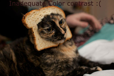
| − | + | [[File:800px-Breaded Cat.edited.jpg|left|400px|thumbnail|A dark color against a dark image is a example of Inadequate color contrast]] | |
| − | + | ||
| − | [[File:800px-Breaded Cat.edited.jpg|left|400px|thumbnail|Inadequate color contrast | + | |
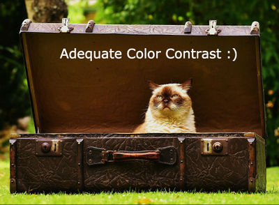
| − | [[File: | + | [[File:Luggage-1643010 960 720edited.jpg|400px|thumbnail|left|However a light text color like white against a dark image is an example of adequate color contrast]] |
<!-- end col-md-8 --> | <!-- end col-md-8 --> | ||
| Line 81: | Line 71: | ||
<div class="col-md-1"></div> | <div class="col-md-1"></div> | ||
<div class="col-md-3 sidebar"> | <div class="col-md-3 sidebar"> | ||
| − | ====Accessibility | + | ====Accessibility Resources==== |
| − | *[https://www.evergreen.edu/accessibility Evergreen's Guide on Accessible Technology ] | + | *[https://www.evergreen.edu/accessibility Evergreen's Guide on Accessible Technology] |
| − | *[[Accessibility_Help|Accessibility Help Page ]] | + | *[[Accessibility_Help|Accessibility Help Page]] |
*[[Tips_for_Providing_Barrier-Free_Access|Tips for Providing Barrier-Free Access]] | *[[Tips_for_Providing_Barrier-Free_Access|Tips for Providing Barrier-Free Access]] | ||
*[[Accessibility_Software|Accessibility Software]] | *[[Accessibility_Software|Accessibility Software]] | ||
| Line 90: | Line 80: | ||
====Canvas Accessiblility Checklist==== | ====Canvas Accessiblility Checklist==== | ||
*[[Accessibility_Checklist|Accessibility Checklist]] | *[[Accessibility_Checklist|Accessibility Checklist]] | ||
| − | *[[Utilizing_Headings|Utilizing Headings ]] | + | *[[Utilizing_Headings|Utilizing Headings]] |
*[[Inadequate_Color_Contrast|Inadequate Color Contrast]] | *[[Inadequate_Color_Contrast|Inadequate Color Contrast]] | ||
*[[Utilizing_Descriptive_Text|Utilizing Descriptive Text]] | *[[Utilizing_Descriptive_Text|Utilizing Descriptive Text]] | ||
*[[Proper_List_Format| Proper List Format]] | *[[Proper_List_Format| Proper List Format]] | ||
| − | *[[Alt_Text_and_Captioning|Alt Text and Captioning ]] | + | *[[Alt_Text_and_Captioning|Alt Text and Captioning]] |
*[[Accessible_Video|Accessible Video]] | *[[Accessible_Video|Accessible Video]] | ||
*[[Create_an_Accessible_PDF|Create an Accessible PDF]] | *[[Create_an_Accessible_PDF|Create an Accessible PDF]] | ||
Latest revision as of 18:04, 17 November 2023
How to utilize adequate color contrast within your web-based content.
Without sufficient color contrast between font and background, people who are color blind or have low vision may not benefit from the information. And using color alone to convey meaning will leave those who are color blind or blind unable to interpret the meaning.
Examples of Inadequate Text Color Contrast
Example of inadequate color contrast
(Yellow is an example of a color that usually doesn't contrast well against a white background.)
versus
Adequate color contrast
Using color can enhance the meaning of an important passage, however, it is important to be careful to choose colors for the text that contrasts well with the background color of the page.
A light color such as pink can be a problematic text color:
Lorem ipsum dolor sit amet, consectetur adipiscing elit, sed do eiusmod tempor incididunt ut labore et dolore magna aliqua. Ut enim ad minim veniam, quis nostrud exercitation ullamco laboris nisi ut aliquip ex ea commodo consequat. Duis aute irure dolor in reprehenderit in voluptate velit esse cillum dolore eu fugiat nulla pariatur. Excepteur sint occaecat cupidatat non proident, sunt in culpa qui officia deserunt mollit anim id est laborum.
versus
However, a dark color such as purple usually contrasts well against a white background:
Lorem ipsum dolor sit amet, consectetur adipiscing elit, sed do eiusmod tempor incididunt ut labore et dolore magna aliqua. Ut enim ad minim veniam, quis nostrud exercitation ullamco laboris nisi ut aliquip ex ea commodo consequat. Duis aute irure dolor in reprehenderit in voluptate velit esse cillum dolore eu fugiat nulla pariatur. Excepteur sint occaecat cupidatat non proident, sunt in culpa qui officia deserunt mollit anim id est laborum.
Typically Canvas and WordPress will automatically format your page with adequate color contrast
However, if you wish to change the color of your text on your site here are directions:
To change the color of your text within Canvas:
- Highlight the text you want to change to another color.
- Click on the Text color icon (letter "A" at left in the toolbar).
- Click on a color in the drop-down menu to apply it to the text.
To change the color of your text within WordPress:
- Highlight the text you want to change to another color.
- Select the icon for Toggle Toolbar
- Click on the Text color icon (letter "A" at left in the toolbar).
- Click on a color in the drop-down menu to apply it to the text.
Tools to Check Color Contrast within Your Text:
WebAim Color Contrast Checker The WebAim Color Contrast Checker is a free site that can check the legibility of text and image by comparing the color of the text against the color of the background.
Colour Contrast Analyser The Colour Contrast Analyser (CCA) helps you determine the legibility of text and the contrast of visual elements, such as graphical controls and visual indicators.
Inadequate Color Contrast with Text Overlaying Images
Sometimes when including images with text, the color of the text contrasted against the images can make the text illegible. Here are some examples of images with adequate color contrast and inadequate color contrast.


