Inadequate Color Contrast
How to utilize adequate color contrast within your web-based content.
Without sufficient color contrast between font and background, people who are color blind or have low vision may not benefit from the information. And using color alone to convey meaning will leave those who are color blind or blind unable to interpret the meaning.
Examples of Inadequate Text Color Contrast
Example of inadequate color contrast
(Yellow is a example of a color that usually doesnt contrast well against a white background)
versus
Adequate color contrast
Using color can enhance the meaning of an important passage, however, it is important to be careful to choose colors for the text that contrasts well with the background color of page.
A light color such as pink can be a problematic text color
Lorem ipsum dolor sit amet, consectetur adipiscing elit, sed do eiusmod tempor incididunt ut labore et dolore magna aliqua. Ut enim ad minim veniam, quis nostrud exercitation ullamco laboris nisi ut aliquip ex ea commodo consequat. Duis aute irure dolor in reprehenderit in voluptate velit esse cillum dolore eu fugiat nulla pariatur. Excepteur sint occaecat cupidatat non proident, sunt in culpa qui officia deserunt mollit anim id est laborum.
versus
However a dark color such as blue usually contrasts well against a white background
Lorem ipsum dolor sit amet, consectetur adipiscing elit, sed do eiusmod tempor incididunt ut labore et dolore magna aliqua. Ut enim ad minim veniam, quis nostrud exercitation ullamco laboris nisi ut aliquip ex ea commodo consequat. Duis aute irure dolor in reprehenderit in voluptate velit esse cillum dolore eu fugiat nulla pariatur. Excepteur sint occaecat cupidatat non proident, sunt in culpa qui officia deserunt mollit anim id est laborum.
Typically Wordpress and Canvas will automatically format your page with adequate color contrast
However, if you wish to change the color of your text on your site here are some directions
To change the color of your text within Canvas:
- Highlight the text you want to change to another color.
- Click on the Text color icon (letter "A" at left in the toolbar).
- Click on a color in the drop-down menu to apply it to the text.
To change the color of your text within Wordpress:
- Highlight the text you want to change to another color.
- Select the icon for Toggle Toolbar
- Click on the Text color icon (letter "A" at left in the toolbar).
- Click on a color in the drop-down menu to apply it to the text.
Tools To Check Color Contrast Within Your Text:
WebAim Color Contrast Checker The WebAim Color Contrast Checker is a free site that can check the legibility of text and image by comparing the color of the text against the color of the background.
Colour Contrast Analyser The Colour Contrast Analyser (CCA) helps you determine the legibility of text and the contrast of visual elements, such as graphical controls and visual indicators.
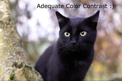
Inadequate Color Contrast with Text Overlaying Images
Sometimes when including images with text the color of the text contrasted against the images, can make the text illegible. Here are some examples of images with adequate color contrast, and inadequate color contrast.


